Better overviews were created and generally improved UX
October 13, 2022
1. Enlarged Tables
For a better overview of campaigns, budgets and portfolios, we have enlarged all tables in Ad Optimizer so that more rows are displayed. We’ve also improved how tables adapt to different screen sizes.
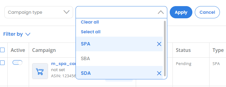
2. Multi-select option to filter the campaign type
We enabled multi-select filtering for the “Campaign type” filter in the Campaigns table and in the Launchpad, so that you can filter for several campaign types at the same time.

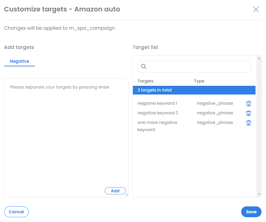
3. Improved UX for targeting settings
We have significantly improved the UX for creating and managing keywords in
Ad Optimizer. Keyword targeting can now be set specifically for one or more campaigns of the same targeting type, “Amazon auto” or “keyword”. This means only options that are possible for the selected targeting type are available.
Customize keywords in Sponsored Product with manual keyword targeting:

Customize keywords in Sponsored Product with Amazon auto targeting:

Besides, we have optimized the synchronization process of the targets with Amazon Advertising.
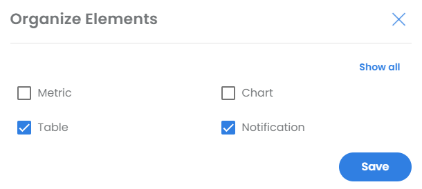
4. Elements on campaign page can now be arranged individually
From now on you can design the Campaigns page according to your needs. For this purpose, we have introduced so-called page elements, which you can show and hide individually. This allows you to display only the elements that you need for your daily work.

Per default you can see the notification filter and the campaigns table. You can easily adjust the settings via the “Page Elements” button.

